 As many of you now know, we not only have an architectural department, we also have a graphics side to dot, that has seen a really exciting growth. Websites, branding, logos, marketing literature are all encompassed under the dot. graphics banner. We thought it would be nice to show the design process behind one of our recent logos, showing you how the creative bods think and work!
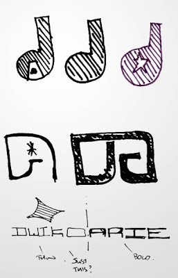 So this logo was for Dwiko Arie Photography. A contemporary and very exciting photographer based in London. Dwiko offers a really exciting service, working on a variety of projects, from Music concerts to weddings, and we were approached to design a brand logo that would take that into account. We got to work on brainstorming over a few cups of tea and some biscuits to see where best to take this brand.
We loved the name, we looked at a variety of cool ways to incorporate the idea of photography into the logo, colours, shapes, even an actual camera, but we kept getting pulled back to this unusual but really funky name, could we incorporate the two? We focused on the initials – D and A and worked on a variety of ways to have two letters work as an individual logo.
After muchos sketching we got to work on the computer, we use a variety of Illustrator and photoshop to turn our scrawls into something more presentable.
This part is really where we see how the client want to push their brand, and after a few discussions we all agreed on keeping it very simple with the close text and the linked letters o and a. This was great for a brand, but we needed a logo, something less obvious than pure text, so we went back to the calera inspiration and took some from the most important part of the device, the lens.
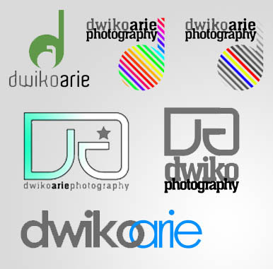
We used the linked o and a taken from the text to create a separate entity, but by amending slightly, we could create a d and a which mirrors the look of a camera lens.
Back to the computer to vector the whole thing and get back to client for colour specs and final comments then.
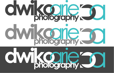 So here is the final product, we went for a variety of greys and whites on the dwiko text, to offer flexibility on chosen background – needless to say the dot team are very happy
with the final product, and a big thanks goes out to Dwiko arie and there open approach to some of our silly ideas. See their work at www.dwikoarie.com


 Its that time of year again and Dot. are off to the Bournemouth Air Festival for four days of aeriel fun and frolics….
 As many of you now know, we not only have an architectural department, we also have a graphics side to dot, that has seen a really exciting growth. Websites, branding, logos, marketing literature are all encompassed under the dot. graphics banner. We thought it would be nice to show the design process behind one of our recent logos, showing you how the creative bods think and work!
 So this logo was for Dwiko Arie Photography. A contemporary and very exciting photographer based in London. Dwiko offers a really exciting service, working on a variety of projects, from Music concerts to weddings, and we were approached to design a brand logo that would take that into account. We got to work on brainstorming over a few cups of tea and some biscuits to see where best to take this brand.
 So here is the final product, we went for a variety of greys and whites on the dwiko text, to offer flexibility on chosen background – needless to say the dot team are very happy